If you owned a brick-and-mortar store, you’d put time and effort into ensuring it’s clean, orderly, and reflective of your identity as a company. That’s why it’s important to do the same for your eCommerce footprint. An Amazon storefront can be a great way to create a coherent first impression, showing shoppers what they can expect when they make a purchase. In this post, we’ll look at eleven Amazon storefront examples that do a great job of curating their overall look.
What is an Amazon storefront?
An Amazon storefront is a self-managed feature that allows companies to present a brand-centric shopping experience. Pages are highly customizable, allowing sellers to integrate banners, photos, images, and unique product layouts via various templates that can communicate brand identity and messaging. Effectively, this allows companies to create an eCommerce shop within the confines of Amazon’s marketplace.
Best Amazon storefront examples
A great Amazon storefront should be a snapshot of a brand’s identity, from the target market to the products available for sale. These are eleven Amazon page samples designed and optimized for an excellent user experience.
1. LEGO
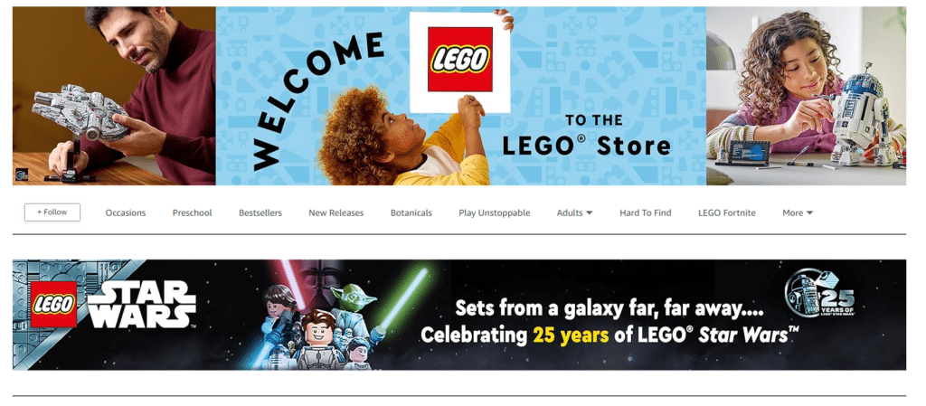
As a beloved toy for all ages, LEGO’s Amazon storefront speaks to fun and whimsy and focuses on adults and children alike. The page is organized based on various product categories and offers customers ways to shop by trends, styles, ages, and themes that speak to unique product needs.
Highlights:
- Use of bright, eye-popping colors.
- Highlights products based on audience and themes.
- Showcases seasonal products—at the time of posting, these included Mother’s Day and spring-related LEGO sets.
2. Reebok
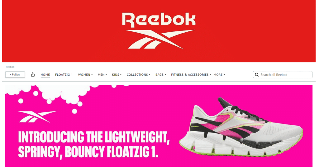
As an activewear brand, Reebok’s page emphasizes the performance and function of its products. Reebok is best known for running shoes, so it’s no surprise that’s what the brand highlights front and center. Focusing on a new shoe, including the technology that makes it superior, complete with product page links, sets up an effective way to entice shoppers.
Highlights:
- Straightforward without too much information cluttering the page.
- Clear product categories.
- Details about key product performance.
3. PK Grills
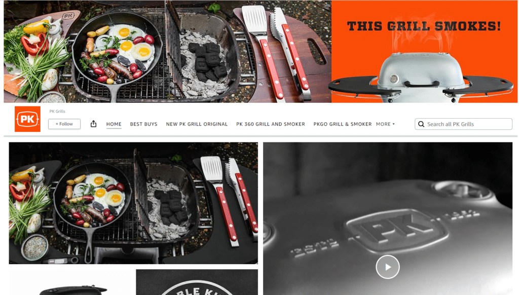
Grilling is all about making delicious food, and the PK Grills storefront seeks to drive this point home with a video featuring meat and veggies cooked to perfection on a popular product. The rest of the page is clean and straightforward, featuring a short description of what sets the brand apart and highlighting best-selling products.
Highlights:
- Video-focused experience of products in use.
- Clear and to-the-point product descriptions.
- Wide array of links to product pages.
4. Godiva
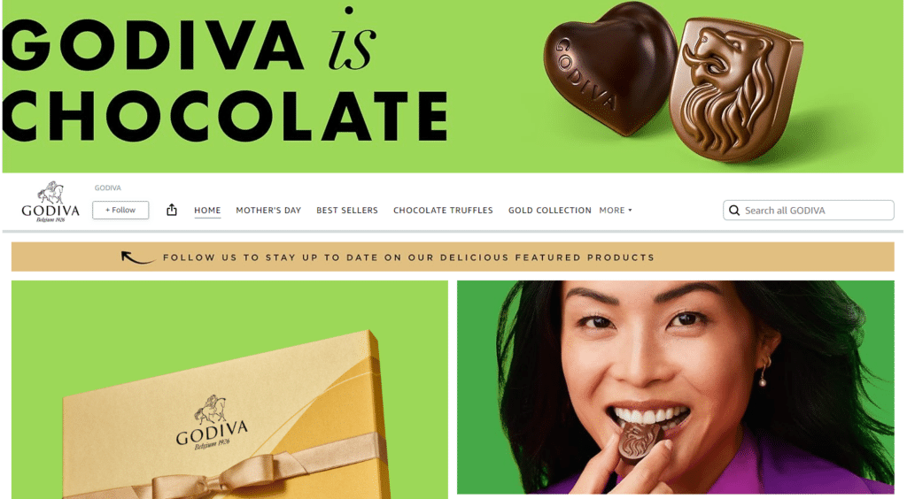
Godiva’s brand is centered around luxury chocolates in many different forms, and that’s the message customers receive from this storefront. In addition to seasonal products, shoppers can find links to bestsellers and individual product lines, like truffle-specific chocolate boxes. In addition, customers can enjoy a video of chocolate production with mouthwatering imagery.
Highlights:
- Wide array of products displayed.
- Strategically placed video of chocolates being made.
- Seasonal products showcased to speak to immediate customer needs.
5. Callaway
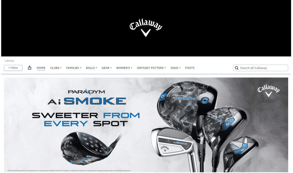
When standard golf equipment doesn’t go far enough, Callaway delivers on unique golfing needs with beautifully crafted and cutting-edge products that leverage technology in innovative ways. Callaway’s brand is centered around being a leading name in performance golfing resources, including smart clubs and AI-driven tools, and their Amazon storefront—sleek and simplistic—is built to match.
Highlights:
- Clean, crisp format.
- Products are divided into easily accessible categories.
- Technology and artistry, Callaway’s specialties, are emphasized.
6. Lenovo
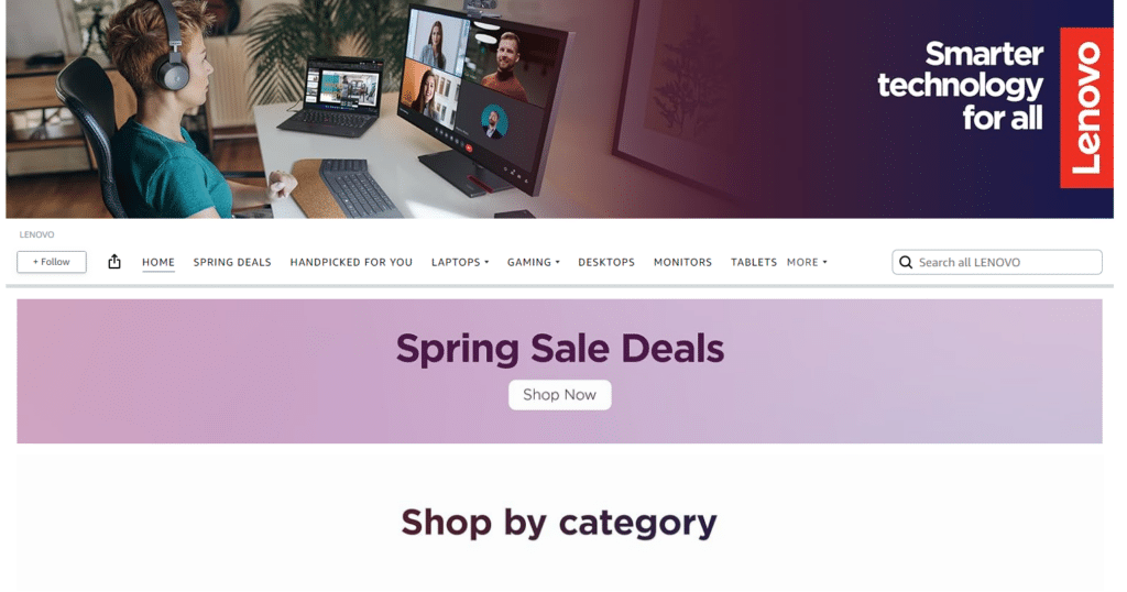
What you see is what you get with Lenovo’s simple, straightforward Amazon storefront, with a page organized into clear-cut categories touching on all major product types. In addition to product links in a “Handpicked for you” section, delivering a personal touch, shoppers can watch a video about Lenovo’s aim to combine performance with sustainability.
Highlights:
- Simple, clean formatting.
- Many links to product categories and individual products.
- Use of videos on Amazon to deliver company goals and ambitions.
7. Beats
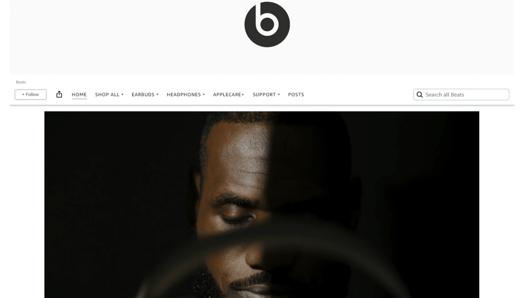
Beats, a brand best known for performance headphones, sets the stage with a stunning video of products in use, a moving piano soundtrack, and a celebrity endorsement from Lebron James. This intro clearly communicates company goals: delivering sophisticated, high-end tech. This storefront also includes category links and infographics highlighting the best attributes of key products.
Highlights:
- Video featuring celebrities using products.
- Sleek, clean setup aligned with brand colors.
- Graphics touching on the most important product features.
8. Petcube
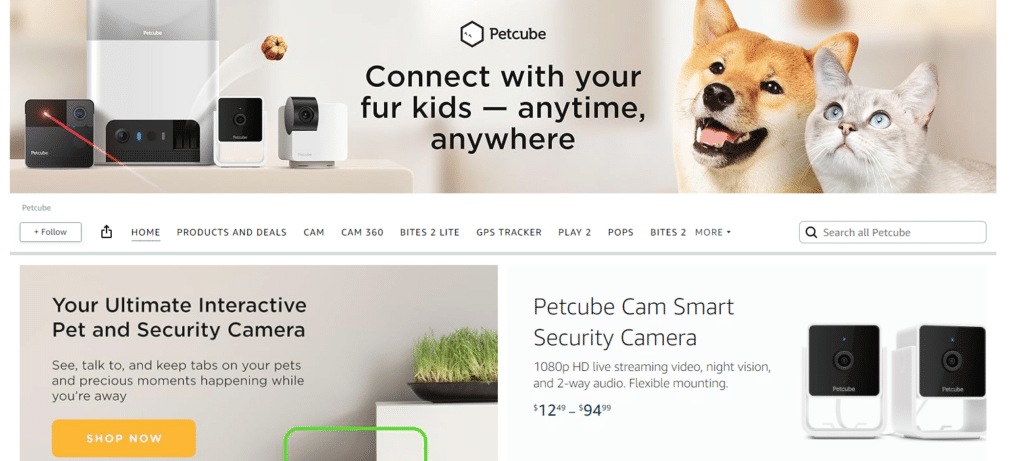
A product line designed to connect owners and pets when not physically together, Petcube’s Amazon storefront is understandably dominated by happy pets and available products. This includes photos of common items, videos showcasing functionality, and text exploring exactly how pet owners can benefit—from around-the-clock security video to the ability to feed furry friends treats from afar.
Highlights:
- Videos and product images of the results of product use.
- Clear descriptions emphasizing product highlights.
- Content centered on delivering the best for pets in a way that tugs on heartstrings.
9. Blitzwax
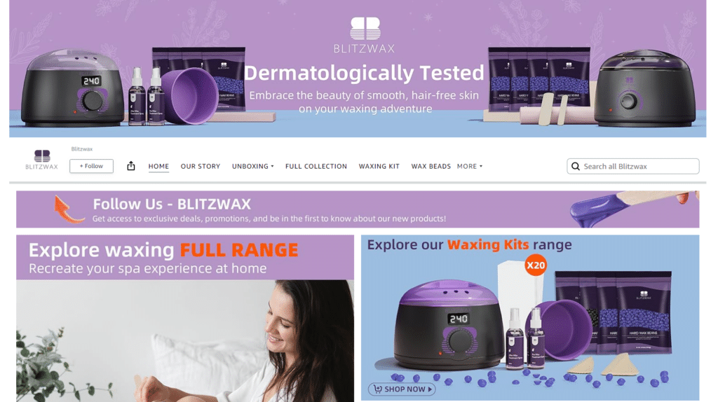
As an at-home solution to a popular spa treatment, the Blitzwax storefront relies on soothing colors and comparisons to luxury experiences. Waxing can be painful, but Blitzwax makes the process appear easy, showcasing videos of product use, happy-looking product models, and assurances of approval from dermatologists.
Highlights:
- Excellent use of product videos demonstrating ease of use.
- Comprehensive catalog of products.
- A message of “your beauty, your way” that speaks to a pleasing at-home experience.
10. Tress Wellness
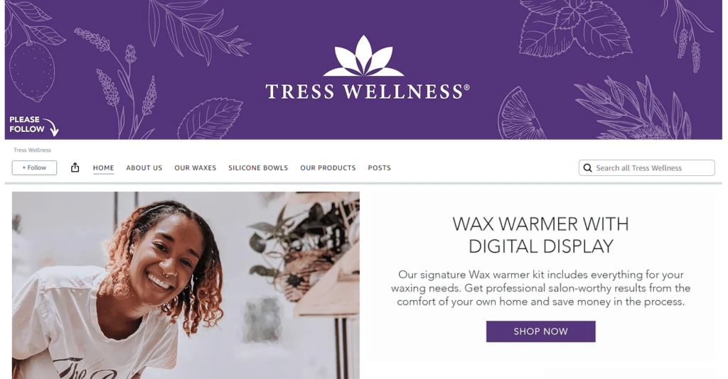
A similar company to Blitzwax, Tress sends a waxing message that also centers on ease of use and a pleasant experience. However, this storefront takes a more holistic approach, speaking to quality, cruelty-free products, the use of essential oils for relaxation, and smooth, silky wax beads.
Highlights:
- Soothing color scheme.
- Emphasis on the safety of products, both in testing and customer use.
- Colorful graphics, including videos that showcase featured products on a loop.
11. Vercord
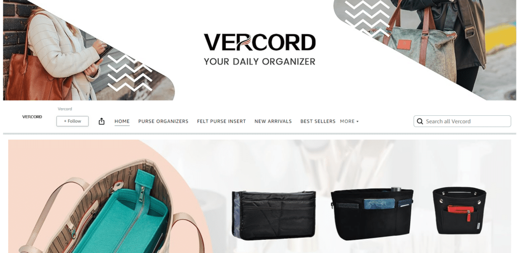
Vercord makes organization easy with an array of products designed to assimilate into your daily life, like purses, packing, and drawer organizers. As the line of products is intended to keep things more orderly, the Amazon storefront for Vercord similarly showcases a clean, simple design. In addition to a wide array of products, shoppers can see how and where the items can be used, like organized drawers, closets, and shelving.
Highlights:
- Neutral color scheme.
- Images of products in use within homes.
- Clear product categories showing the depth of available inventory.
Amazon storefront best practices
The value in a storefront can be immense—provided you’re approaching design and product information in the right ways. These best practices can help you set up an Amazon storefront that reflects your brand and resonates with your customers.
Simple navigation
An Amazon storefront doesn’t have to be simple in its design, particularly if your products meet complex needs, but navigation should still be straightforward. Shoppers shouldn’t have to struggle to find your products or product categories. Ultimately, your most important and popular items should be front and center.
Focus on a logical layout that utilizes a top-down approach. Put products, messages, images, and links that offer customers the most value at the top of the page and down from there. Link to live ASINs for your products so that it’s as easy as possible for customers to make a purchase.
Hero banner
A hero banner is a perfect way to showcase your brand’s most important elements. Located at the top of the page, this is the first thing a customer will see when coming to your storefront, so it needs to encapsulate your identity as a company as best as possible. This can mean using the company logo and colors, highlighting products, or a catchy tagline to attract shopper interest.
Text overlays
Marrying texts and images can be a great way to add depth to what you’re trying to showcase, helping shoppers immediately see the value in a purchase. Don’t go overboard, though. Too much text can be distracting and likely won’t be easily translated for shoppers in other markets. Keep overlays high level and ensure products stand out with or without this information.
Strategic images and videos
Images and videos can show your products in use, helping customers visualize your items as part of their everyday lives or as an essential solution to a problem. However, avoid using so much media that a customer might become overwhelmed. Instead, place key photos and videos throughout your page to entice storefront visitors to keep scrolling.
Brand messaging
What does your brand represent? Innovation? Fun? Luxury? Whatever you’re trying to communicate, ensure your storefront exemplifies the key characteristics. This can be done with images, color schemes, language choices, and the products you choose to feature.
Highlight product benefits
When creating content for your storefront, focus on your differentiators: What makes your brand stand out in the market? Explore product benefits that set you apart from the competition, whether that means pricing, performance, or any other central trait. When handled properly, this can guide customers, leading them from your stunning storefront to strategically created product listing pages.
Final thoughts on Amazon storefronts
For companies looking to create a streamlined, brand-driven approach to eCommerce, like those who’ve invested in Amazon FBA, a well-designed storefront, like the Amazon store examples above, can communicate who you are, what you have to offer, and why shoppers should click Buy Now.
At Trellis, we support Amazon stores across categories with merchandising, from our dynamic pricing tool to AI product content that is customer-focused yet optimized for organic search. To learn more about how we can lend a hand with marketing aspects of your Amazon storefront, connect with us.


